03. Process/Solution
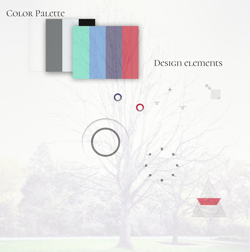
Reveals my beginning color palette and the simplest atoms of my atomic design that eventually creates my entire page.

The Science of Color and Emotion | is an informational website that describes the connection between colors we choose and why we choose them.
As humans, we use colors for everything around us. It's the first thing the human eye sees and connects our emotion too. For example, blue is seen as calming, but productive. The color is used a lot in study spaces because it promotes a peaceful feeling.
Colors are especially important to Marketers and Designers because we use different variations and styles to attract the target audience we're seeking.
If we want to sell something or promote a product, designers use reds because it establishes a sense of urgency and importance.
Colors are so important, that even certain cultures use an excessive amount of certain colors to express their way of life.
Yellow is used widely in Asian culture because it shows happiness, glory, wisdom, harmony, and culture, which shines light on their personality.
What's your favorite color? I bet it matches your personality.
Background | The audience starts on a landing page. This page displays a navigational wheel that includes eight colors including: yellow, orange, red, purple, blue, green, black, and white.
After a color is chosen, it will transition to a new page where it will define the color in detail. Explaining it's qualities, traits, personality, and connection to human emotions.
The landing page also includes links to "Right Brain" and "Left Brain" that also transitions to another page explaining the different characteristics of each side of the brain.
Artistic or logical, humans need balance on both sides to have a healthy brain.
The Problem | The focal point of this webpage is to inform the audience about the different characteristics between each color and how we can use it in our daily lives to benefit ourselves and others.
Goals and Objectives | As a front-end designer, I am trying to capture the audience with my aesthetic design so I can redirect their attention to why colors are so important. I want the audience to see the beauty in color and how we can use it in our advantage as artists, designers, architects, or decorators. The options are endless when working with colors.
Reveals my beginning color palette and the simplest atoms of my atomic design that eventually creates my entire page.
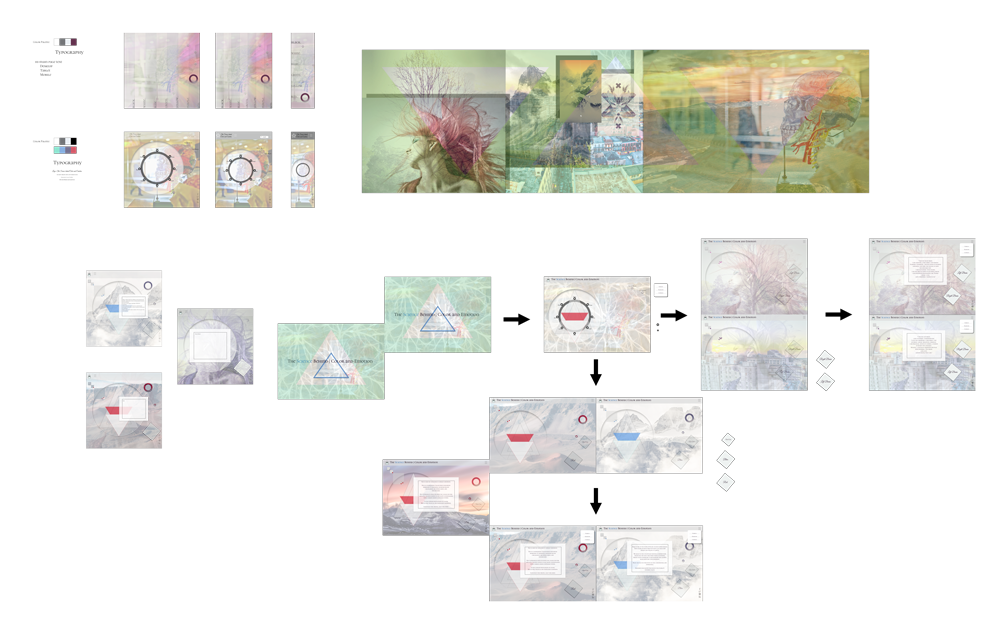
Reveals my entire work flow from beginning to end including the process of how my design changed throughout the weeks.